Pantone Color of The Year
The Pantone Color of the Year is a color chosen annually by Pantone to represent the year's most influential colors. It has been a trend for companies to use these colors in their marketing campaigns and products in recent years. The color represents the feeling that the year should provoke.
In 2017, Pantone chose two colors: Greenery and Serenity. Greenery symbolizes "the reconnection we seek with nature," while Serenity "captures the mental calm that comes with finding order in our lives." In 2018, they chose purple-red Radiant Orchid as the year's color.
In 2019, they chose Living Coral as their 2020 Color of the Year. The color is described as "an energizing and optimistic tone that evokes feelings of warmth and comfort."
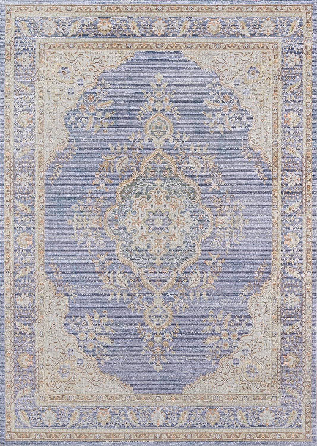
For 2022 The color is 'VERY PERI,' a periwinkle hue with warm violet-red undertones. This is a great color choice as we spend more time in the home.
"Very Peri Injects a sense of playful freshness and joy into the home interiors-it's a versatile shade that enlivens any space."- Leatrice Eiseman, Executive Director of the Pantone Institute.
According to color therapists, being around Periwinkle hues spark creativity and focus. A great idea is to put 'Very Peri' colors in your home office of creative nook areas. Anywhere you need to focus or come up with an idea.


No comments: